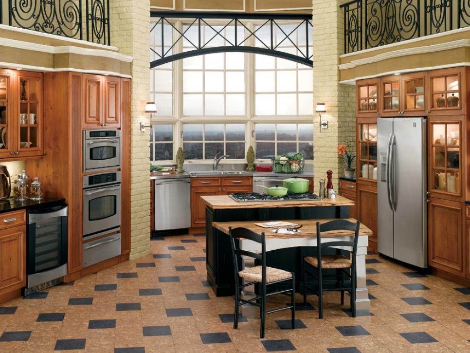
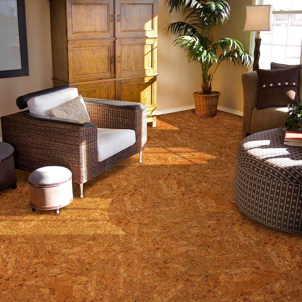
When I started researching cork flooring for my home office renovation, I assumed the color options would be limited to that familiar honey-brown bulletin board tone I’d always associated with cork. What I discovered instead was a surprisingly rich spectrum of colors, from pale champagne and soft gray to deep espresso and rich caramel, that genuinely opened up my design possibilities in ways I hadn’t expected.
Choosing the right cork color turned out to be one of the most enjoyable parts of the entire project, and after going through the process myself and living with the result for two years, I have a lot of practical thoughts to share about what to look for and how to choose well.
Understanding the Natural Color Range of Unfinished Cork
Before you start looking at stained or dyed cork flooring options, it helps to understand what natural cork actually looks like because that natural palette is the foundation everything else builds from. Unfinished cork has a warm, organic tone that ranges from pale creamy beige through golden amber depending on the specific cork oak harvest and the granule size used in the flooring product. That natural variation is part of cork’s appeal and part of what gives it an organic quality that manufactured flooring can’t fully replicate.
The granule pattern visible in cork flooring creates a subtle texture that catches light differently throughout the day. Finer granule products have a smoother, more uniform appearance while coarser granule products show more visual complexity and depth.
In natural tones, that granule variation reads as warmth and organic character. I find it genuinely beautiful in a way that grows on you over time rather than demanding attention the moment you walk into a room.
One thing worth knowing about natural cork is that it responds to sunlight over time. Areas exposed to direct sun can lighten or shift in tone, while areas covered by rugs or furniture stay closer to the original color.
This photosensitivity is mild compared to some other natural materials, but it’s worth factoring into your placement decisions and furniture arrangement from the beginning. A quality UV-resistant finish coat helps slow this process considerably.
Light and Pale Cork Colors for Bright, Airy Spaces
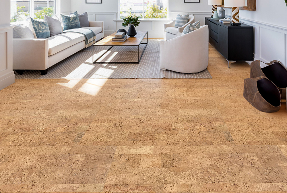
When I was choosing my office floor, I seriously considered a pale champagne cork that was close to natural but with a lighter, slightly cooler undertone achieved through a light finishing process. Pale cork colors are wonderful for spaces that don’t get much natural light because they reflect what light is available and make the room feel more open and airy. My office faces north, and the light tone I ultimately chose makes a noticeable difference in how bright the room feels throughout the day.
Pale cork works beautifully with white and off-white walls, light wood furniture, and soft neutral textiles. It creates a cohesive, calming palette that’s very popular in Scandinavian-influenced interiors right now. If your design sensibility runs toward clean, uncluttered spaces with natural materials and a restrained color palette, a pale cork floor provides exactly the kind of quiet, grounded foundation that lets everything else breathe.
The practical consideration with very pale cork is that it shows dust and debris more readily than mid-tone options. I sweep my pale cork floor every couple of days, and I’m fine with that routine. If you have pets that shed heavily or a household with a lot of tracked-in dirt, a mid-tone natural cork might be more forgiving between cleaning sessions. It’s a small tradeoff for a beautiful result, but it’s worth knowing upfront so you’re not caught off guard.
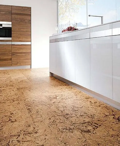
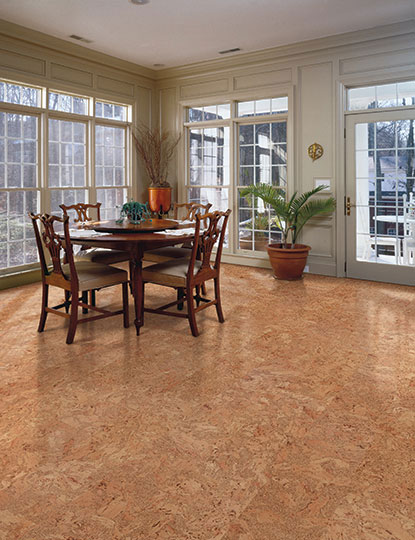
Honey and Amber Tones, The Classic Cork Look
Honey and amber cork tones represent the classic cork flooring aesthetic that most people picture when the material comes to mind, and there’s a very good reason these tones have remained popular for decades. They bring genuine warmth to a room in a way that cool tones simply can’t match, and they work harmoniously with an enormous range of furniture styles and wall colors. Natural honey cork has an almost golden quality when sunlight hits it that I find incredibly appealing.
These mid-range warm tones are also the most forgiving in terms of maintenance. They hide minor dust between sweepings, don’t show footprints the way darker finishes do, and camouflage small scratches better than very light or very dark options. For a family home with kids and pets, a honey-toned cork strikes an ideal balance between visual warmth and practical ease that I’ve seen work successfully in many different spaces.
Honey and amber cork tones pair well with warm wood furniture, terracotta accents, cream-colored walls, and earthy textiles. They suit traditional, transitional, and bohemian interior styles particularly well. If you’re decorating a living room, bedroom, or dining space where you want the floor to feel welcoming and warm rather than cool and contemporary, the classic honey cork tones deliver exactly that without requiring any particular design skill to make them work beautifully.

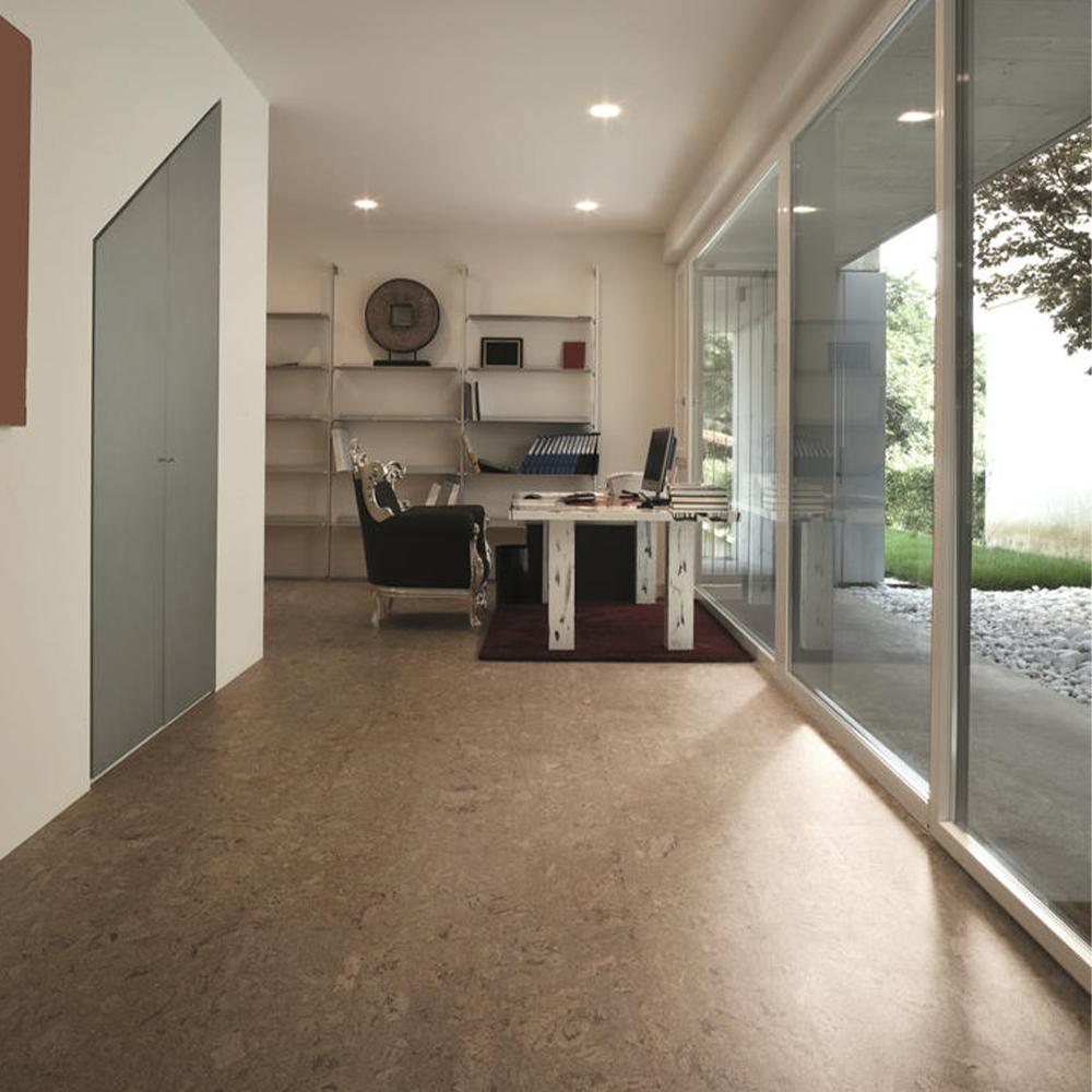
Dark Cork Colors for Drama and Sophistication
When I was renovating my home library, I wanted something richer and more dramatic than the pale cork I’d used in my office. I discovered that dark cork flooring in deep espresso, walnut, and rich chocolate tones is genuinely stunning and creates a completely different atmosphere than lighter cork options. The same material that feels light and airy in a pale tone feels grounded and sophisticated in a dark one, which speaks to how much color choice shapes the personality of a space.
Dark cork is achieved through staining during manufacturing, and the quality of that staining process affects the final result significantly. The best dark cork products have deep, even color that still allows the natural granule texture of the cork to show through, creating visual depth and complexity. Lesser products can look flat or overly uniform, losing the organic quality that makes cork appealing in the first place. Ask to see samples in different lighting conditions before committing to a dark product.
The practical consideration with dark cork is the same as with any dark flooring: it shows dust, pet hair, and light-colored debris more readily than mid-tone options. I keep a good dry microfiber mop accessible and use it daily in my library rather than every few days. The payoff in terms of visual richness and drama is absolutely worth that extra sweeping frequency to me personally, but it’s a lifestyle consideration worth being honest with yourself about before choosing a very dark tone.
Gray Cork Flooring for a Modern, Contemporary Look
Gray cork flooring is a relatively recent addition to the color spectrum and has become one of the more exciting options available for contemporary interiors. When I first saw gray-tinted cork in a showroom, it stopped me in my tracks because it had all the warmth and texture of natural cork combined with the cool, modern aesthetic of gray that’s been so dominant in interior design. It felt genuinely fresh and different from anything I’d seen in natural flooring materials before.
The gray tones available in cork range from very pale silvery gray that reads almost as a cool white through medium smoke gray to deeper charcoal tones. The undertones within those grays vary between cool blue-gray, neutral gray, and warmer greige tones that sit between gray and beige. Getting undertones right is critical for gray cork because a gray floor with the wrong undertone can clash subtly with your walls, furniture, and other finishes in ways that are hard to diagnose but genuinely uncomfortable to live with.
My advice for choosing gray cork is to bring your largest paint swatch or a wall sample when comparing floor samples rather than evaluating them in isolation. The interaction between your wall color and the floor undertone is what you’re really assessing. I’ve seen gray cork look beautiful in one context and oddly green-tinged in another based purely on the wall color it was sitting against. Evaluating samples in your actual space under your actual lighting is the most reliable way to make a confident choice.
Creating Patterns With Mixed Cork Colors
One of the most distinctive things you can do with cork tile flooring is mix colors to create geometric patterns, and this is a design approach that genuinely excites me every time I see it done well. Because cork tiles come in consistent dimensions and multiple color options, you can create checkerboard, herringbone, basket weave, and border patterns using two or more cork colors that express real personality and design intentionality in a space.
I used a two-tone pattern in my entryway combining a pale natural cork with a deeper amber tone in a classic checkerboard layout. The result looks custom and carefully considered in a way that a single-color floor simply doesn’t, and the installation wasn’t significantly more complex than a standard single-color installation. The key is planning your layout on paper first and calculating your material quantities carefully for both colors before purchasing to avoid running short of either tone mid-project.
For pattern work with cork, I recommend sticking to colors that are clearly different enough to read distinctly once the floor is installed and finished. Colors that are too similar in tone can blur into each other and lose the pattern definition you’re going for, especially after the sealing coat goes on and the tones shift slightly. A sample layout on your actual floor using loose tiles before committing to adhesive is the best way to preview the pattern effect in your specific space under your specific lighting.
Can cork flooring colors be changed after installation by staining or painting?
Yes, cork can be sanded lightly and restained to change its color, though the process requires care and the results depend on the existing finish and stain color. Going darker is generally more reliable than going lighter. I’d recommend consulting with a flooring professional before attempting a color change on an existing cork floor. It’s much easier to choose your color carefully before installation than to change it afterward, so investing time in sample selection upfront saves significant effort later.
Do cork flooring colors fade over time?
Natural and stained cork can shift in tone with prolonged direct sunlight exposure, typically lightening in sun-exposed areas over time. Applying a finish with UV inhibitors significantly slows this process. I use window treatments in rooms with direct afternoon sun to protect my cork floors from uneven fading. Rotating rugs periodically also prevents stark contrast between covered and uncovered areas. Quality pre-finished cork products from reputable manufacturers have better UV resistance than lower-priced alternatives.

Which cork color is the most practical for a busy family home?
Mid-tone honey and amber natural cork tones are the most forgiving for busy households. They hide dust between cleanings, don’t show footprints the way dark finishes do, and camouflage minor scratches better than very pale or very dark options. I’ve seen these tones work well in homes with multiple kids and pets without requiring obsessive maintenance. If you want a light or dark tone, simply commit to a slightly more consistent sweeping routine and the floor will still look great with modest effort.
How do cork flooring colors look in low-light or north-facing rooms?
Pale and natural honey tones perform best in low-light rooms because they reflect available light and keep the space feeling open and bright. I installed pale cork in my north-facing office specifically for this reason and the difference compared to the dark laminate it replaced was dramatic. Dark cork tones can feel heavy and cave-like in rooms with limited natural light. If your space has lighting challenges, err toward lighter cork tones and supplement with good artificial lighting for the best overall result.

Are darker cork flooring colors more expensive than natural tones?
Pricing for cork flooring varies more by product quality, thickness, and brand than by color alone. Some specialty colors or custom-mixed tones may carry a modest premium, but in most product lines the color options are priced identically. Focus your budget decisions on wear layer quality, cork density, and finish durability rather than color. A well-made natural cork will outperform a poorly made espresso cork every time, regardless of which color you find more visually appealing for your space.
How do I choose between multiple cork color samples that I like equally?
Bring your top two or three samples home and live with them in the actual room for several days, placing them on the floor in different areas and observing them at different times of day and under different lighting conditions. Colors shift dramatically between morning light, afternoon sun, and evening artificial light. The sample that consistently looks best across all those lighting conditions is your answer. Also consider your furniture and wall colors at each evaluation rather than looking at the sample in isolation from its surroundings.
Related Posts: